Outdoor Digital Advertising Screen Company Strategies for Stronger Urban Brand Visibility
2026-11-18
Outdoor screens are no longer just bright billboards—they’re the sharpest tools for making a brand impossible to ignore in crowded city spaces. Yet most campaigns still rely on tired formats that vanish into the urban noise. zemso approaches this differently, treating every screen placement as a strategic point of contact rather than a static display. In this post, we break down the methods that turn passing glances into lasting recognition, and why the right mix of location, timing, and content turns ordinary foot traffic into measurable brand momentum.
Turning Busy Intersections into Recognizable Brand Landmarks
Most city corners are treated as pass-through spaces—wide curbs, predictable signal boxes, and blank sightlines that fade from memory the moment someone walks away. Yet these intersections hold a rare advantage. They force people to pause, even for a few seconds, and that brief stop is an opening to introduce a visual rhythm, an unexpected material, or a small detail that makes the brand feel rooted in the neighborhood rather than dropped in from elsewhere.
A recognizable landmark seldom comes from a single oversized sign. It grows from layering the right cues into the streetscape. A painted ground plane can extend from the crosswalk into an entryway, a repeated color or texture shows up on bollards, planters, and railings, and signage reads clearly at walking speed. When these pieces are calibrated to the actual movement of the intersection, they create a quiet but persistent recognition that builds every time someone passes through.
The strongest results happen when the placemaking feels useful, not just decorative. Seating that offers a real place to wait, lighting that improves the evening walk, or a directional marker that helps people orient themselves can carry the brand without shouting. Over time, residents begin to use the corner as a meeting point or a reference in directions—proof that the intersection has become part of daily life, not just a campaign backdrop.
Designing Screen Motion That Holds a Walking Audience
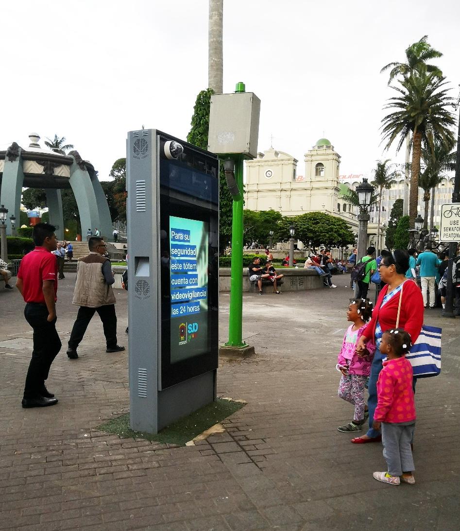
Motion aimed at people on the move has to earn attention before the brain decides the screen is background noise. Sharp contrast shifts and a clear focal point work better than constant movement, because a walking viewer rarely gets more than a second or two of steady gaze. The first frame should carry the message, with animation used to direct the eye rather than decorate the edge of the frame.
Pacing matters more than polish. A slow fade can disappear into peripheral vision, while a sudden but short burst of motion registers without forcing someone to stop. Keeping the core message in the same screen position across transitions also helps, since the viewer's field of view is already shifting with every step. If the layout jumps, the message gets lost before it lands.
Finally, design for the glance, not the stare. Text and key visuals need enough scale and contrast to be read from an angle and at a moving pace. Motion should resolve quickly and then hold still, giving the message a stable moment to be understood instead of competing with the physical movement of the audience.
Using Neighborhood Cues to Keep Creative Relevant
When a campaign starts losing traction, the first instinct is often to strip it down and start fresh. But relevance can also be rebuilt by looking sideways—at the neighborhoods, communities, and micro-conversations already gathering around the topic. These smaller spaces tend to move faster than broad industry chatter, and they often surface language, rituals, and tensions that mainstream summaries miss. Borrowing from them keeps the work grounded in how people actually talk, not how a brief assumed they would.
The trick is to treat these cues as raw material rather than decoration. A phrase picked up from a niche forum, a recurring complaint in a local Facebook group, or a meme format circulating inside a specific subculture can all point to what still feels alive about the idea. The goal isn’t to mimic the neighborhood, but to let its rhythm reshape the message. That shift can make a familiar theme sound less like a brand announcement and more like something that belongs in the feed.
Keeping relevance this way asks for a lighter touch. Instead of chasing every trending cluster, it helps to watch for the ones where the original idea already has some echo. Those are the places where a small adjustment in tone, reference, or framing can pull the work back into view without forcing it. The neighborhood isn’t a target; it’s a listening post, and the cues it offers are usually enough to make the old feel current again.
Fitting the Urban Rhythm Without Blending Into the Noise
There is a moment, usually just after the evening rush, when the city exhales. The tempo drops from frantic to steady, and the soundscape separates into layers: a bus door folding shut, a kitchen vent humming above an alley, footsteps that do not try to match anyone else's. Fitting into that rhythm has little to do with imitation. It means finding the cadence you can sustain without drowning out the smaller, stranger notes that make a block worth walking twice.
Noise is easy. It asks for volume, repetition, and a willingness to be noticed. Rhythm is harder because it requires listening before responding. In practice, that might look like a storefront that keeps its lighting warm instead of loud, a set of window displays that change with the seasons rather than every trend cycle, or a conversation that leaves room for the sound of rain against the awning. The goal is not silence; it is presence with a lower shoulder.
The places and ideas that stay with us tend to do this well. They borrow the city's momentum without letting it flatten their edges. They are audible, but only to the people already paying attention. That is the difference between adding another layer of noise and contributing a tone the street did not know it needed.
Inviting Passersby to Shape the Message
A blank panel taped to a fence starts with a single unfinished sentence: “This corner needs more…” By late afternoon the line has sprouted answers in three handwriting styles, two languages, and one drawing of a pigeon. Letting passersby finish, cross out, or rewrite a message turns a fixed announcement into something closer to a local argument, with all the mess and surprise that implies.
The real shift happens when the initial wording is deliberately left a little unstable. Instead of asking people to react to a polished slogan, you give them a half-formed idea and a piece of chalk. Some will sharpen it, some will mock it, and a few will quietly add the detail you would never have known to include. Those additions often carry the accents, complaints, and small generosities of the street far better than a final copy ever could.
Moderation becomes less about control and more about noticing what sticks. When a phrase survives the afternoon, it has already been tested by impatience, humor, and bad weather. That is the version worth photographing or printing, because it belongs to the place rather than to the person who first wrote it.
Tracing Visibility Through Real-World Actions
A brand does not become visible because a dashboard says so. It becomes visible when someone walks into a store, asks a question, lingers near a shelf, or pulls out a phone to compare prices. These small physical decisions leave traces that matter more than aggregated clicks. Watching how people move through a space, what they touch, where they hesitate, and what they ignore reveals which messages actually reached them and which ones never landed.
Real-world actions also cut through the noise of assumed intent. A person can scroll past a campaign every day without registering it, yet the same person might stop at a window display, pick up a product, or mention it to a friend. That shift from passive exposure to physical follow-through is a clearer signal. It forces a different kind of listening, one based on observed behavior rather than declared preference.
The challenge is connecting those moments without reducing them to data points. A receipt, a footpath, a returned item, a brief conversation with staff—each one carries context that a simple conversion metric misses. Tracing visibility this way means respecting the texture of everyday decisions and using them to understand not just who noticed, but what they did after noticing.
FAQ
It tends to come down to motion, scale, and timing. A static message fades into the background, but a well-timed switch between bold visuals and short copy can pull attention from people who are already scanning their surroundings. Screens placed at decision points—near transit entrances, crosswalks, or popular lunch corridors—work harder because they reach people when they are already looking up.
Look beyond raw foot traffic. A corner with lower pedestrian counts but longer dwell time can outperform a packed plaza where everyone rushes past. The most useful signals are pause points: bus shelters, ride-share pickup zones, outdoor seating areas, and intersections with long signal cycles. Also consider sightlines from multiple directions and whether the screen is visible before people commit to a turn or entry.
Short, visually distinct sequences beat long repetitive loops. Use a mix of product close-ups, high-contrast typography, and brief scenes that change every six to eight seconds. Avoid cramming multiple messages into one spot. If the screen is near food or retail, aligning the creative with the immediate context—weather, time of day, local events—helps it feel relevant rather than generic.
Combine on-the-ground observation with indirect demand signals. Track branded app activity, foot traffic to nearby stores, and direct visits to a local landing page by neighborhood. Use geofenced surveys or QR codes with unique parameters. Photograph the screen at different hours to verify brightness and visibility. Sales lift in nearby stores can be a stronger indicator than impressions after the screen has been live for several weeks.
Poor brightness control and slow content refreshes. A screen that is too dim at noon disappears, while one that stays at full brightness at night feels harsh and may trigger complaints. Content that runs unchanged for months loses impact quickly. Remote monitoring, scheduled brightness adjustments, and a content calendar with regular small updates prevent the network from feeling stale or poorly maintained.
Treat the screen like a rotating exhibition rather than a loop. Change the creative sequence by daypart and weekday, introduce occasional short-form content such as local weather, transit updates, or neighborhood facts, and rotate brand stories instead of repeating one slogan. Even small visual shifts—new color treatments, different product angles—signal that the screen is active, not abandoned.
The ones that become landmarks usually serve a public function beyond advertising. They might display reliable transit information, showcase local artists between ads, or become a gathering point during events. When a screen feels useful to the neighborhood, people develop a habit of glancing at it. That habitual attention carries over to the commercial messages, making the location more valuable than a screen that only pushes ads.
Partnerships with nearby venues, cultural institutions, and transit authorities can place screens in locations that would otherwise be hard to access and give the content a local voice. A screen outside a music venue can promote upcoming shows alongside brand spots, which draws a more receptive crowd. City partnerships often come with maintenance and power advantages too, while local business tie-ins can fund shared content and keep the screen relevant.
Conclusion
A screen at a crowded intersection does not become a brand landmark just because it is big. The stronger move is to make the location part of the brand memory: steady color patterns, repeated placements, and sightlines that match how people actually cross the street give a corner more recall than a louder, busier display. Motion design matters in small doses. Since walkers only glance for a second or two, loops with one clear focal shift hold attention better than rapid edits. The creative also works harder when it borrows from nearby cues, like a familiar neighborhood landmark or the rhythm of a local commute, instead of running generic national content. Successful screens tune themselves to the street's pace. They slow down during quiet mornings, shorten messages in rush hours, and leave breathing room rather than fighting every other light, sign, and window display on the block.
Some campaigns push further by inviting the audience to participate. A quick vote, a motion-triggered change, or a phone prompt turns a passive look into a small exchange, and that brief moment of agency makes the message stick longer. Measuring visibility then comes from behavior, not just impressions. A lift in store visits, a spike in nearby redemptions, or people stopping to photograph the screen says more than a passive view count. When those actions are connected back to specific creative choices, the company can learn which blocks respond to playful content, which respond to direct offers, and which need a calmer visual style. Over time, that feedback keeps the screens from fading into the general urban noise and gives each placement a sharper role in the surrounding street.
Contact Us
Contact Person: Leo
Email: [email protected]
Tel/WhatsApp: +86 18901905138
Website: https://www.zemsogroup.com/